Intro
I’m still using version 4.0.1 of the Butterfly theme and haven’t synced with the developer’s updates in years. Over time I made a few custom interface changes and just kept using it that way. I never really had the time to revisit the whole thing.
A couple of days ago, after using AI to completely redo my personal homepage, I ended up browsing a forum and seeing how other bloggers had styled their sites. That suddenly gave me the urge to tinker with my blog theme again with AI’s help. Most of my visitors come from RSS and search engines, so hardly anyone actually lands on the homepage. But since I’m usually busy, I often return to the homepage first when I later come back to reply to comments on posts. So even if the homepage isn’t where most readers arrive, I still spent two on-and-off days reworking it.
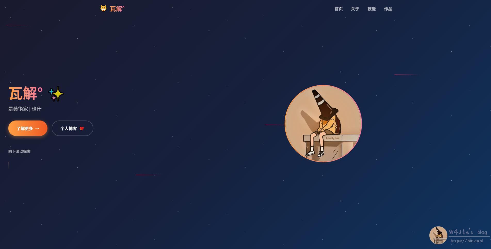
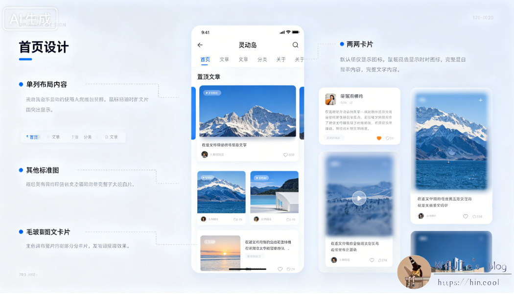
Turning the Navigation Into a “Dynamic Island”
The theme’s default navigation bar originally had a semi-transparent white border, with the menu centered across the top. I had already changed that border to fully transparent before, and later, for a cleaner look, I tucked the menu into a secondary “More” menu. That made the whole interface feel a bit simpler.
After seeing ideas from other bloggers, I wanted to try a Dynamic Island–style navigation too. AI helped implement that the same night. I also wanted to move blogger up to the top of the post page and switch to a single-column layout, so the first rough version looked like this:
Redrawing the Background
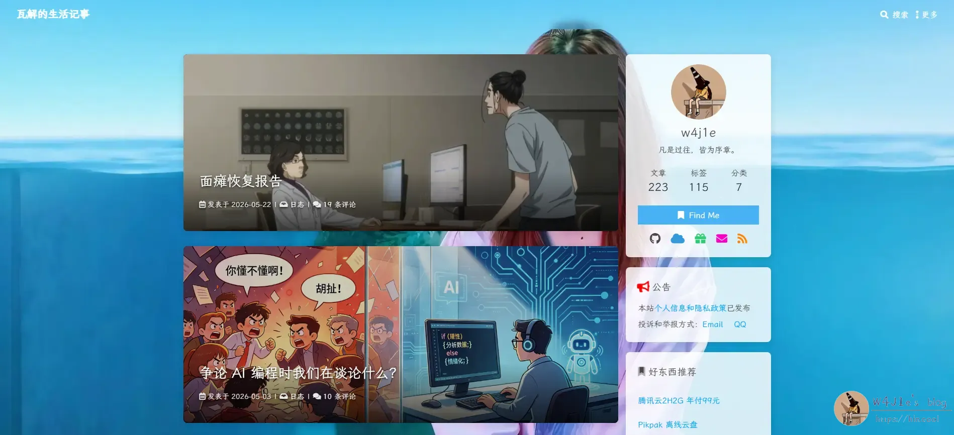
Once I saw that first draft, the single-column layout started to feel a little too plain. The photographic background also didn’t really match the rest of the visual direction.
I asked Doubao for design suggestions, and the mockup it produced was, frankly, not very useful at all.
So I turned to ChatGPT instead. The difference was obvious. It suggested using code-generated SVG for the background and gave me a much more convincing visual reference.
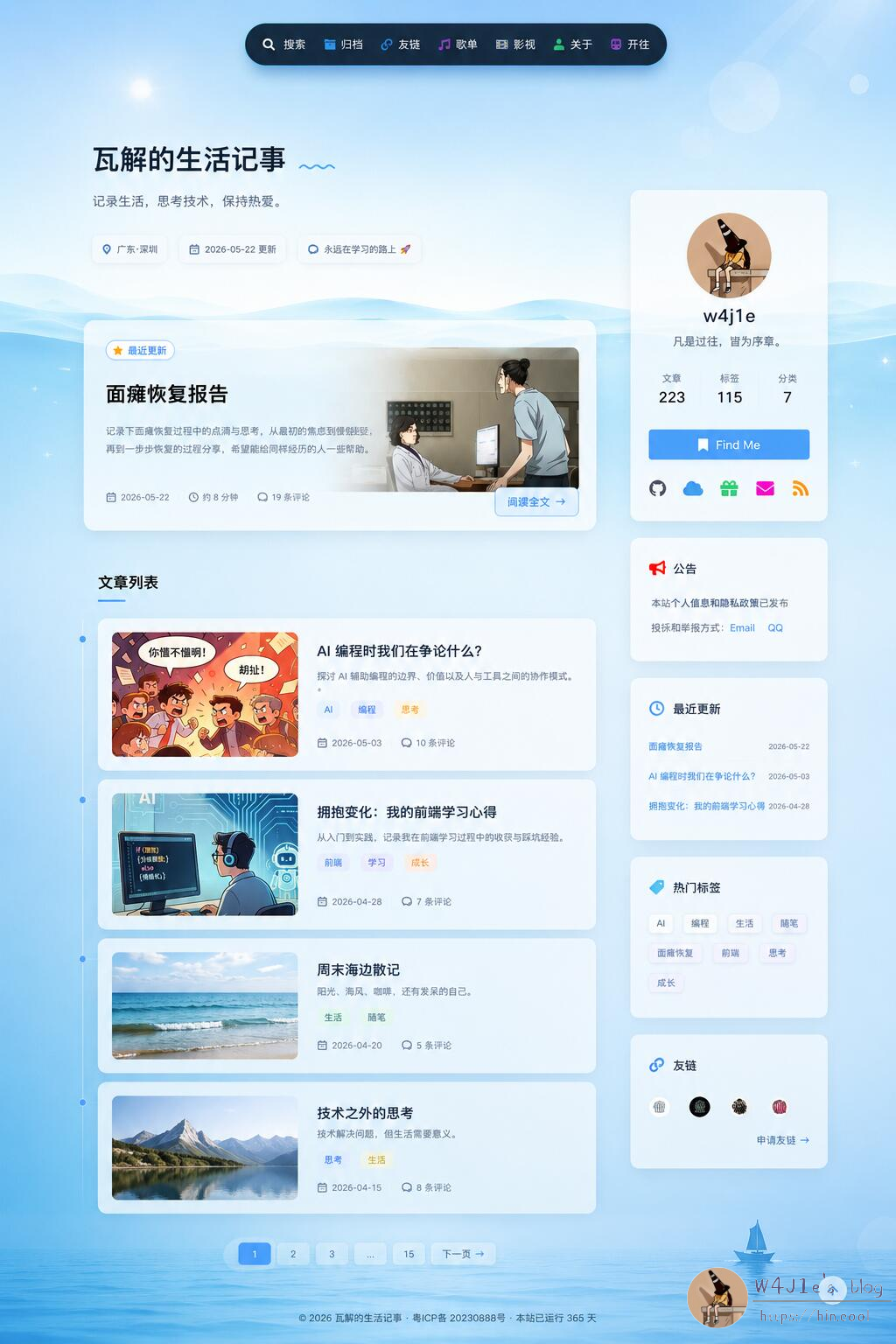
ChatGPT still clearly leaned toward a two-column layout, and honestly, on desktop that does work better. A single-column homepage is very minimal, but it can also come across as a bit flat.
Since I couldn’t log into Codex, I used the GLM5.1 model through Trae to handle the actual modifications. I had ChatGPT generate the prompt, and GLM5.1 implemented something fairly close to that reference design.
Fine-Tuning the Balance
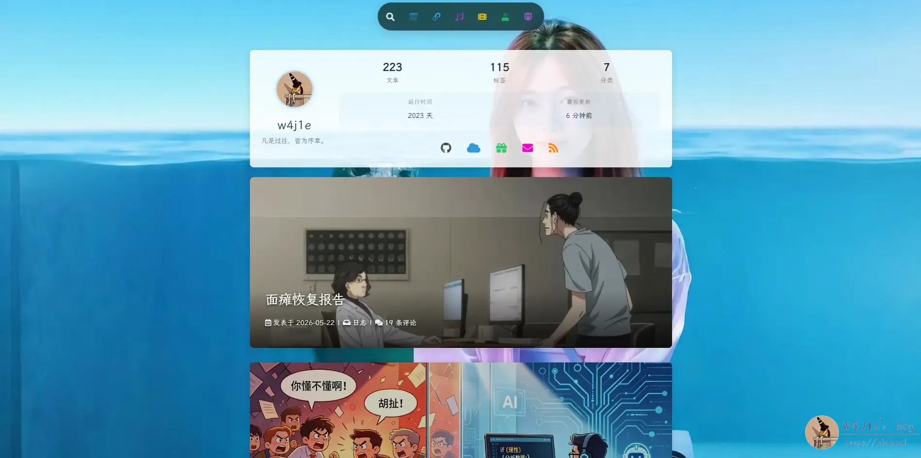
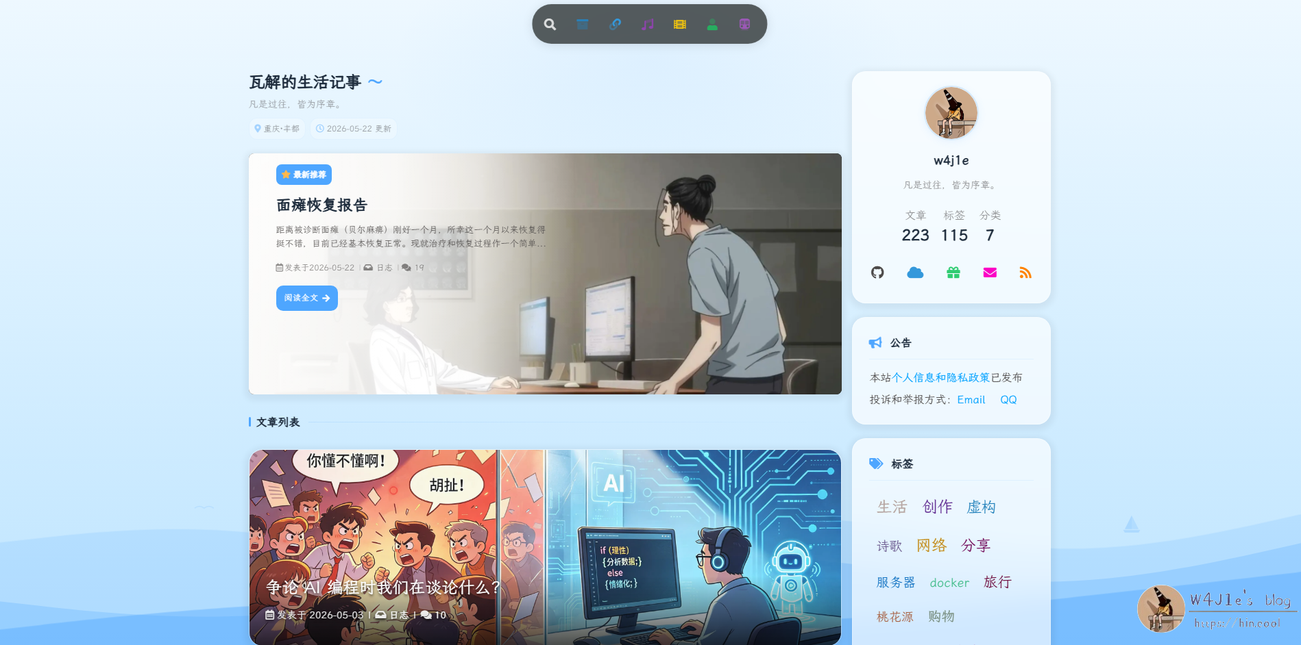
Even then, the page still didn’t feel completely harmonious. It lacked a bit of texture and polish. So I had AI help me make several more adjustments: reducing the height of the post cards, increasing the transparency of the sidebar, and changing the Dynamic Island background to a semi-transparent white that turns dark in night mode.

When I looked at it again the next morning, I still felt something was off. The larger post cards did pull most of the visual focus toward the content, but if you looked deliberately at the sidebar, it felt too plain compared with the image-filled article cards. So I started adjusting things again.
This time I set both the Dynamic Island and the sidebar to 80% transparency. I changed the “latest post” button into a blue outlined style with a semi-transparent fill. I also removed the “read full article” button entirely so that each card, like the other posts, could simply be clicked as a whole to enter the article page.
There was another small visual issue: the wave graphic at the bottom right had been cropped vertically. I reworked that part too, improving how the waves were displayed and enlarging the sailboat so it floats along with them.
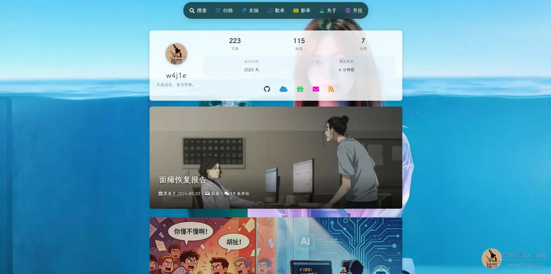
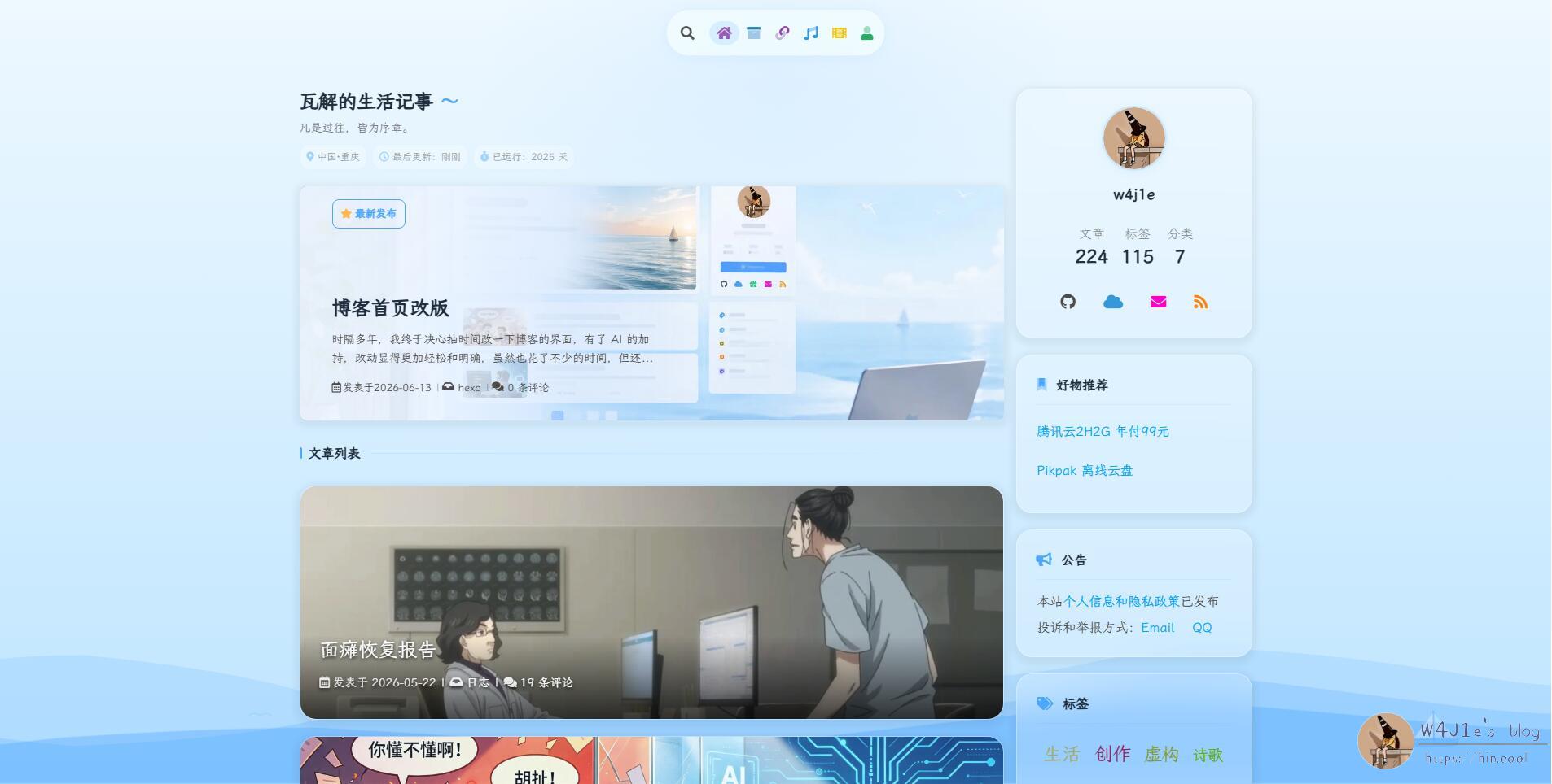
The final result ended up like this:

Still Not Fully Settled
To make the sidebar and the post cards feel more consistent with each other, I also considered another direction: changing the article cards to match ChatGPT’s concept more closely, with an image on the left and text on the right, plus a white gradient overlay on the text side. At the same time, I could lower the opacity of the sidebar cards so the nearby colors would feel more unified.
I haven’t fully decided on that yet, so I’m still weighing whether it’s worth changing further.
One thing this round of editing made very clear again: AI is incredibly useful for this kind of interface experimentation. GLM5.1 doesn’t support image input, so during the process I also tried Doubao again. Doubao can recognize images and lets you preview and screenshot changes after modifications, which is convenient. Even so, compared with ChatGPT, it still felt a step behind.